
For this challenge Patti has asked us to show pairs of the same image in color and black and white. She also asks us to compare the differences in mood, texture and light and which version we prefer.
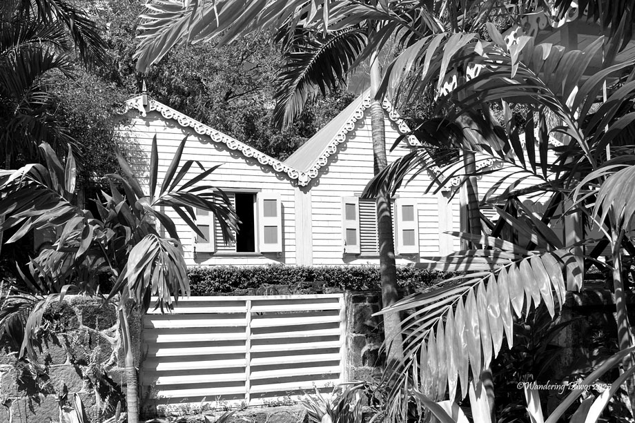
I have featured this bright yellow house in St. Kitts before so I decided to see what it would look like in black and white. The color version looks like a happy place while the black and white version feels like a scene from an old movie set in the tropics. I like the color version better.

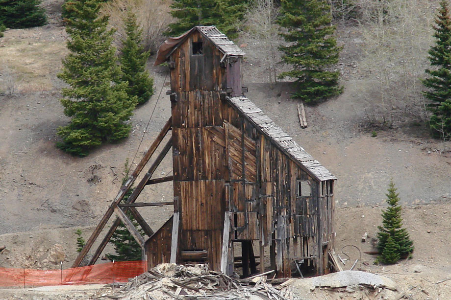
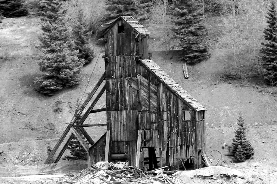
The next image is of an old gold mine along the San Juan Skyway in Colorado. The color image shows the details of the aged wood contrasted with the green trees. The black and white image brings out the texture of the wood and trees. I prefer the black and white image because it reminds me of an old photograph.
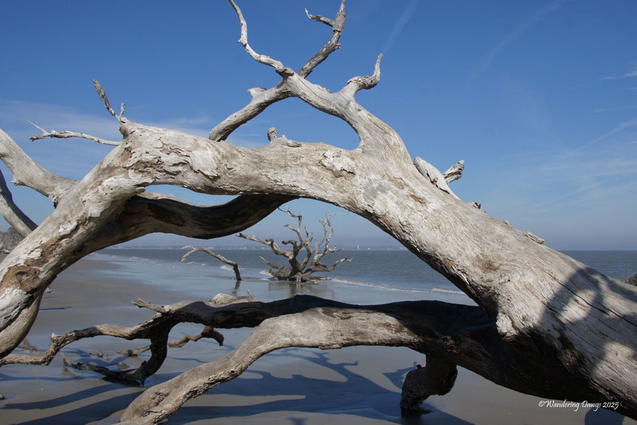
The following image was taken on a sunny day at Driftwood Beach on Jekyll Island, Georgia. In the color version the blue of the sky and ocean give me a feeling of a beautiful day at the beach. In the black and white version the dark sky and shadows give me the feeling of a storm coming. I prefer the color version of this pair.

Many thanks to Patti for this challenge Lens-Artists #334 – Exploring Color vs Black and White


A wonderful set of comparisons Beth – each really delivers a different mood. I agree with your comments on each image, except that on the final image I prefer the B&W which I find quite powerful.
LikeLiked by 1 person
Tina, thanks so much. I admit I like the black and white image, too. The color image reminds me of the beautiful day on the beach.
LikeLike
Beth, you picked great examples to show how we can “feel” a photograph. I like the happiness in the first color photo, as you pointed out. As for the others, the monochrome versions are my favorites. Beautiful set.
LikeLiked by 1 person
Egidio, many thanks. I had fun with this challenge.
LikeLiked by 1 person
Great choices for the challenge, Beth! I like color so the yellow house wins the day! The beach wood looks moody in both images.
LikeLiked by 1 person
Thanks Terri! This challenge was fun for me.
LikeLiked by 1 person
I often will convert my photos to black and white if it seems like they will benefit. I agree with the Gold mine and the the yellow house. My feeling about the driftwood is a toss up. I felt they both had something to offer Beth. Great challenge. Good job. –Curt
LikeLiked by 1 person
Curt, thank you. The black and white driftwood seems to be the most popular. I like it but the color reminds me what beautiful beach day it was.
LikeLike
Hard to beat association with a pleasant memory, Beth! Grin.
LikeLiked by 1 person
Last one for me has to be in monochrome but with the other ones, I agree with you 🙂
LikeLiked by 1 person
Sofia, thank you. I had fun with this challenge. The black and white driftwood seems to be the most popular.
LikeLiked by 1 person
Love the yellow house but I think I like the b/w for the other two
LikeLiked by 1 person
Nora, many thanks.
LikeLiked by 1 person
Beth, the first two call for color, but the tree branch does well in B&W.
LikeLiked by 1 person
Anne, thank you. The black and white driftwood seems to be a favorite.
LikeLiked by 1 person